Several images appeared yesterday on the internet proclaiming to be next season's LFC shirts.
» Order your new LFC 2013-14 home shirts today
» Order your new LFC 2013-14 away kit today
Liverpool have abandoned the old policy of only replacing the home shirt every two years and as such a new Liverpool home kit for 2013-14 will also be produced alongside an away and third kit.
These are the images of next season's kits.
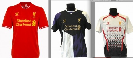
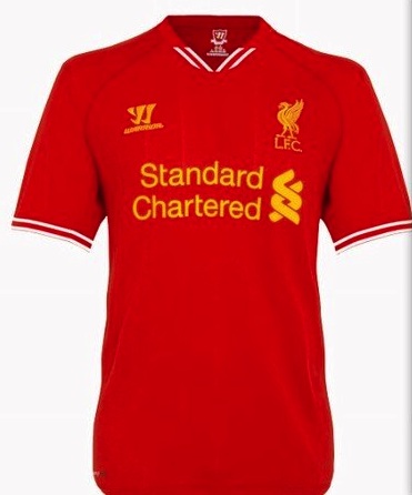
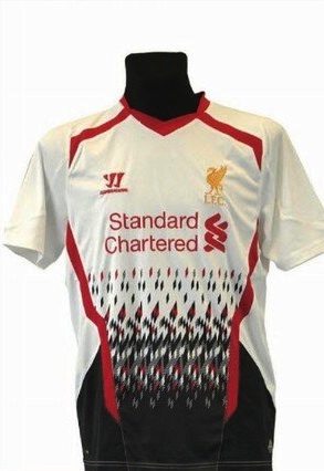
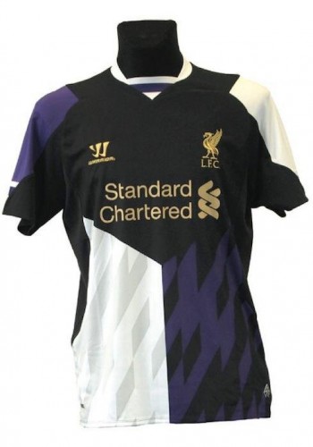
We'd love to know your opinions.
Our opinion?
The home shirt's okay. 😉
You can now order the new Liverpool FC Home Shirt



Love the pool dont agree with the 3rd kit could be well better
This kit does not represnt #LFC Very well
The white one looks like my granny sweater…
Wenger hints at move for Rooney Fußballtrikots http://trikots2013.blogspot.com/
2nd looks like a knitted jumper
2nd and 3rd absolutely terrible, really bad. The home is nice but could be better. Why cant they bring out the traditional yellow or white or even grey like the 80s as 2nd and 3rd kits.
Nooooooooo!!!! Please… Somebody just kill me… Why does Warrior wanna torture us like that? Hope its not real…
Don’t like these Warrior tops…so cheap and tacky…haven’t bought a single Warrior shirt and won’t. I treasure my Adidas top!!!
Whatever happened to class ? I suppose this is the american influence
I’m not to fond of wearing colours out and about,so I usually buy my shirts to potter round the house in. I could still do that with the red shirt but I wouldn’t even were the other two for a bet. Gonna lose a fist full of commercial dough for those shocking designs. The commercial manager needs to be asked questions about allowing these terrible 2nd and 3rd shirts to be sold.
2nd and third kits…were popular in the 80s…Not so anymore. Save the Time and Money and redesign PLEASE! YNWA!
only the home kit looks good the 2nd n third kit should b sent back to the 80s.
they are all cool
what is this? ridiculous!
awful away and 3rd kit
complete over reaction by everyone because you are used to a one colour shirt for all occasions. this is the future deal with it tho saying that the 3rd one will look better at aintree come national day
quite like them, apart from the 3rd. I really dislike that one. Cheer up everyone 🙂
I drank too much red wine last night and puked up the 3rd kit, I’m suing for copyright
a very bad shirt. this season shirt WARRIOR is the best
I just know why Carra decided to retire…What a terrible design!!!
Home kit is passable but the white kit looks like a jumper I wore in the late 70’s!!!
Away kit….lost for words.
I feared for the kits Warrior would produce, but given this first year I was optimistic …my fear has returned.
‘We come not to play…but be laughed at!’
No no no! Home shirt fine, other two a joke surely. I am already on my heels explaining why LFC is still the greatest club in the world. The shirts will not help 🙁
Plain ridiculous!!! The red is ok, which by far poor for Liverpool standards.. I can see our away n 3rd kit being placed 1st n 2nd int the worst ever jerseys made over the decade. Let this be a false rumour, hence ample time for change…
Guess we will only purchase the home jersey and my beloved LFC will lose millions in non sales of both the away and alternate jerseys. Yes, ”THEY ARE TERRIBLE!!!” 🙁
probably the worst kits man has ever made!!! the 1st one only looks decent because the other 2 are so so…soooooo so bad!
the home shirt is ok, the rest I fail to grasp how anyone comes up with this.
home shirt is ok, but 2nd and 3rd look like they were designed by chimps in the dark, or look like something you wore while painting the shed, Just buy the home one because we are THE REDS.
WTF!They are all awful. Shoot the designer!
the red one is good, the black one is bad, and the white one was probably designed by a blind chimpanzee
1st kit is OK, the other 2 are ridiculous, a throw back to the shocking kits of the ’80s!
home kit is way awsome!
but it would be real shame if away and third kit will be those i see upone!
I don’t like any of them, at a push I’d say the home shirt is wearable but the other two are plainly awful.
Home shirt is ok, the white one looks like a truck ran over it and the third one is hopefully our away jersey and not the second one…Warrior are sticking to the classic look with the home shirt which is nice.
The home shirt looks like a manc top and the other two look like the screen when a commodore 64 freezes
If real, I cant believe that LFC would produce such a ridiculous 2nd and 3rd top again.
They did it last year, and sales were not good.
Once again home top is cool
the 3rd strip last season broke all records for sales
Home kit is OK, don’t like the other two!
me too , home shirt is okay