Later today Liverpool Football Club will unveil their finalised plans for a New Anfield stadium to Liverpool City Council.
Significant improvements in the stadium design, particularly in terms of future capacity, weere a key factor in the Liverpool takeover early this year. Both American Chairmen believed the club was not being ambitious enough in building a stadium with a maximum capacity of 60,000 and although tomorrow’s design’s are only believed to be for a 61,000 seater – the structure will be such that extension work can create a possible 70-76,000 seater Anfield. The club are aiming to re-submit plans during construction such that the new stadium will open with a capacity of around 66,000.
As we all wait with baited breath let’s have a look at some of the previous designs , and mock ups from the past few years to whet our appetite…
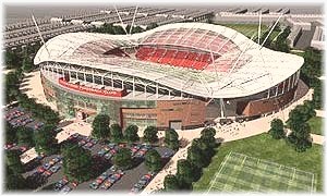
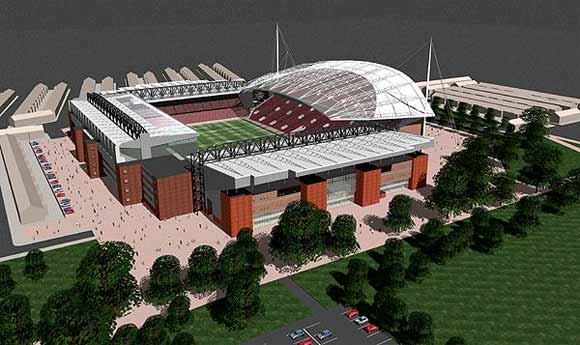
The one below is the most recently linked with us as recent as April 2007 before new plans were drawn up
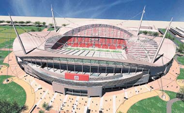
And these are the most recent pictures, showing Anfield re-aligned with the Kop facing in the same direction as it is now and with a futuristic look.
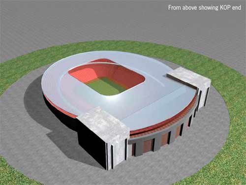
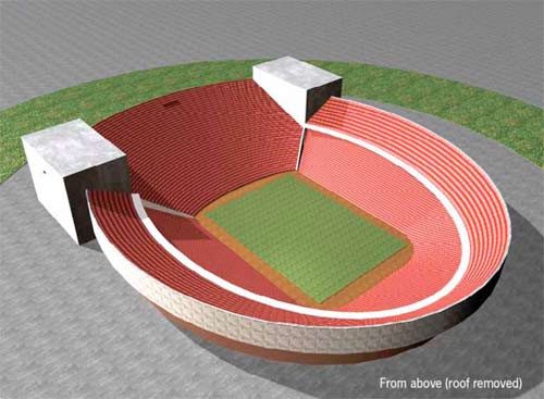
However, my personal favourite is the design below which was posted on our forums by a 3D graphic designer interested in architecture. I’m loving that massive Kop…
Now that the club have submitted the final designs we can expect to receive some official announcements and press releases during the next week or so as the plans hopefully get the nod.
More discussion on the new stadium is in the forum



They should re-develop anfield instead of building a new stadium anfield is a crucial part of lfc
the picture at the top is the best the second looks just like the old anfield just with a new roof at the kop end.
Who designed the second stadium (the expanded Anfield) this is probably the nicest design.
I know its good to have a change every once in a while, but deep down they should keep Anfield as it is. But out of all designs shown I think the last design does it for me. With the 2 concrete blocks there could be a statue of the great Bill Shankley on one of them and Bob Paisley on the other.
i thin it is brillant hope l.f.c get on well in there new stadium
This is a stadium for the team and i realy love it i hope the team and staff love it too.Good luck lfc supporter
what a team
The last two look like crappy versions of the Camp Nou, or an old South American stadium. The futuristic designs, where every stand is unique, is the best as it keeps to the vintage & classic stadium designs of English clubs
They should make sure they get some acoustic engineers, the kind of people who build concert halls, to make sure that the noise from the Kop end is boosted by the architecture. That way we could REALLY intimidate opponents on big nights…
I love this club…..and only the best should be acceptable….I will die a happy man if I live to see the kop with 25,000 on again.
similar to the last 2 will will do me! a monster kop is the most important thing!
Liverpool
6
I think 4 & 5 suck, they look like poor versions of a US college football team stadium, please don’t Americanise it too much! 1 & 3 look ok but to me are too generic, they remind me of the Emirates and Old Trafford. I like the idea of the KOP in #2 but the rest of it looks a little dated.
the 3rd design is the best 4 liverpool fc
go for three with 70,000. and make sure there is a good pie stand.with five once you give someone a paper you will never get them off the seat. does the roof tilt up from one end.
Can’t give out the pdf, you’ll definitely prefer the new designs though. Kop is big as the pitch, very visible and its roof is original.
looks like we will have to dig pretty deep to get the 4+5 designs to work,maybe we might find some old everton trophies.
I love pics 4 & 5….I think if images of Shanks and Daglish were carved into the concrete/stone blocks it would look great.
Last 2 are the best by far, cant wait 4 the real designs to be published. As long as their is a proper kop I dont really care what it looks like
Liverpool are undoubtedly the best team in the world and will be amazing in whatever stadium they play in so these are all just formalities…as everyone knows liverpool will win everything next season…
Although I support c palace i have great respect for liverpool and its fans.
I really like the second design, does anyone when will it will be unveiled? When will the work start?
I prefer design 3 because it keeps the history of the clubs older anfield and bring in the new and sometimes changes are for the best
I think the last one would be the best because of the massive koptribune!
HAHAHA…That last design does resemble a toilet bowl. The new Kop is meant to be extra special according to Hicks, nobody builds stadiums quite like the yanks. Very exciting.
imagine the sound of the kop with that last design, it will scare any away team
I did prefer the first design. But someone did point out to me that it resembles Old Trafford so I may have to re-think it.
Its better to make a copy of the millenium stadium !that will be a great stadium 4 Liverpool FC .
Like the last design, it looks unique.
ClarkyCat – you have a copy of that PDF?
I like the last plan for the sheer size of the kop but there’s no need for the 2 concrete blocks. They could have put more seats in.
I think the 3rd stadium does it 4 me
The bottom design looks brill, maybe neaten that up and it’ll look even better. The one that looks just like Anfield but with a bigger Kop looks old and dated, no way do I want to see that and I don’t think the Yanks will want that either.
I don’t know..the first three were great..but the last two??
Well – once those Mighty Reds claim the new stadium theirs, it will be better than all others..no matter what the design
Hi Vincent,maybe they could call it the Weetabix Bowl,then with the money maybe 50 million quid they could by Ronaldinio.
The old plan looked to much like Sporting Lisbons stadium so I’m glad they have re-designed it.
I’ve never posted here before but I want to let y’all know that I’ve seen a pdf of the plans for the new stadium and it look awesome. The kop is huge. It beats all of the above designs easily. You will be pleased!
The last design looks like a toilet bowl (minus the roof). I prefer the first.
Cheers.