|
New Kits 07/08 |
|
|
|
|
The famous home red shirt will have one more crack at the Premiership title next year as Liverpool are set to keep it, but both the Liverpool away shirt and the Liverpool European away shirt are set to be replaced in the summer.
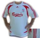
Liverpool’s new away kit will be a white shirt with black shorts.
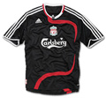
The new European away kit will be all black.
Both kits are expected to contain a flash of red, similar to the design used by the European XI at Old Trafford last week.
The kits below are NOT the final design – however, they are adidas designs for 2007/08 transferred in to Liverpool’s colours and will form the basis of the new shirts.
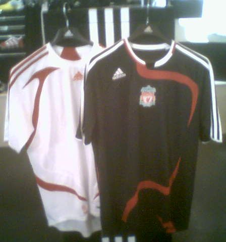
We have been informed the first kit has been pencilled in for release on June 21st 2007.
Although rumours have been abounding for a few months we have now received confirmation from our source at adidas who helped us predict the first adidas kit designs last February about the colours for next season.
We had been expecting a home Champions League kit, but the replacement of both yellow and European away kits will be a surprise to many reds fans.
(Update March 2007: A confirmed design for the away kit with the Carlsberg logo – similar to the above kits)





i like the yellow shirt
amwell win the league dis seasonm
i am getting the black one 2morrow and might get the white one later on in the season when its cheaper does any1 think i making the wrong decision?
these two kits by my opinion are the best kits we have brought out for years because bringing the stripes back on some kits looks awesome escpecially on the black one
i love the black one…..cause its my favourite colour.
the away one is cool too.
is the home shirt gonna stay the same?
I like both the white and the black. I think that the bad thing about the black kit is that the LIVERPOOL badge is in the middle not like the others on your right and the pattern is too boring atleast its better thanthat awful yellow kit.
black jersey unreal, are the ones on e-bay fake by the way?
the new kits look really nice an i will definately buy the euro away kit, but i also thought our yellow kit was good, whats wrong with the green logo?
I agree with Panya, the other thing that really annoys me is that the away kits always feature the Carlsberg logo in GREEN these days. I know it’s their corporate colour and they do pay the club a small fortune but it ruins the kits – the yellow one last year would have been bearable if the logo had been red and matching the 3 stripes etc. – similar this this time with the new white one, an early shot showed it in red (again matching the red stripes) but no, it’s in green again.
To my mind the best kit of recent times was the Reebock European home kit from 2001 – really good red that stood out fantastically under the floodlights with the badge (and Carlsberg logo!) in yellow/gold.
We’re a classic club and Adidas do some really simple classic sportswear so I wish we’d go down that route rather than complicating things – I might start buying the things again then, rather than wearing my replica 78 away kit!
Both sick kits, i really hated the collar on the old home one.
likeing the black one really nice so iz the white n red one!!!
i think the away kit is very nice and smart but the euro kit i don’t like because its black and it don’st match the other ones.
i think the new white kit is looking good. its trendy and appealing to the new generation of liverpool supporters. GOOD JOB. but the black one, hell no.
old ones was easy better but the black ones ok
Who designed the black one? Toffees or Mancs? Cos it’s f****** s***.
emm, not sure about these two to be honest!!! Adidas do make nice kits but I’m extremely dissapointed with the new range. Why Black, and whats with the swirl all about?? Why cant the white kit be as simple as “white, 3 red stripes for the arms/shoulder and the respectives logos” thats it!!! We’re a massive club and we need to look fantastic, please re-design!!!
If you click on my name it should hopefully link you to what adidas’ new keeper top’s might look like (since we’ll have the same one as every other club that is sponsored by them) although the real thing could be in a different colour.
this kit looks like **** change it
The white one look class, but the black ones crap.
I’d like to see a new red & gold home euro shirt like the old Reebok one, instead of another away euro kit because I love our green and white one. But who cares, I’ll end up buying it anyway.
The white & black shorts is a nice throw back to the glorious 80’s, as long as they keep the green out of it. Don’t like black, it’s too dark for the night time away games. We tried it before. I will miss the yellow, we had some big performances in it this season. But, they can play in the nude, as long as we keep winning.
I don’t think we sould worry about the kit just what they do on the pitch
they look like normal tee shirts to me…
the black one looks nice tho,if only the adidas stripes would be in red colour
is Carlsberg still our shirt sponsor? i thought they extended till the end of this season after champs league final last time. have the renewed agreement? shirts look ok. white one looks good, black one looks like some has had a nose bleed down the front. i’ll probably still end up getting it though. anyone got any idea of the keepers jersey colour or am i getting too exited?
euro kit is awful
away kit is cool
i love it
i hope they dont bring another black one out the last one was a shocker. The white one will be okay, as long as its not full of wiggly lines and patterns. i hope the club shop get more than ahandfull in when they get released. last season was a shambles.
Doubt the big pics of the jerseys will be the jerseys for next season they are the same as the 1s from the Daglish charity match. The small pic looks more like it id say but i saw lots of prototypes last season and they didnt look anyway close so who knows wat we will get.But dont like the black stick to the yellow we won the champs league last time and hopefully this time .C,Mon tha Pool
They look like Training Kits don’t like them at all.
or so i’ve heard anyway. im probaly wrong now haha how silly will i look lol
i know the euro shirt will be black and gold
personally i like the yellow shirt im aware that im in the vast minority the black shirt seems quite nice altough it does look like a trianing shirt as jay said plus red and black is kind of scumchester colours as long as it is bright but not floresent i,ll be happy
i googled ‘liverpool jersey’ and on the 4th page it had a liverpool jersey which was white with red wavy lines, can anyone expain?
i think the shirts are nice and even if you dont like there your team and you should support that
they look great once they put the carlsberg sponsor on they will not look like training shirts
the new kits look like training tops however, the white 1 is well nice!!
Great colour choice, white top and black shorts look quality!!!
I say keep the european away though, that kit has hardly been used and looks wel gud!
I like them. They might look like training shirts now but so did this seasons before the ‘addias ball’ went on and Carlsberg. If these are the shirts i think the final product will look better
I do like the idea of playing in black but the red design looks hideous. But the yellow kit needs to go. Its awful. Alternate kit is nothing to write home about.
i think the away kit is like the kit when shankley was the gaffer not bovered wat the kit looks like as long as we play well (this kit is very nice)
I don’t like the look of them, but I sure hope we still have “Carlsberg” as the sponsor still.
lets hope that these are not the final design 1 looks like a t-shirt the other a training top
when i heard last year we were changing to adidas i thought great cause theyre always nice kits.but much to my disgust the womens design was awful and it looked nothing like the mens.why is this???? for this reason i will not be buying any liverpool kits unless the womens looks like the mens i am still wearing my reebok one and it fits great and looks great..get it sorted adidas
I think that we should have the same design we have now but Black and White
ahh…these kits look really impressive and much better than the yellow at the moment! a few more adjustments to them would be good so they dont look like training tops but i like the style
i think the black shirt is not that great they both look like training kits. this is lfc we should not wear black its blasfory we r not man utd
not bad but they need alot of improvement as they look more like training tops at the moment
Right. These definatly have to be the training kits. I cannot see these becoming our away/away euro kits.
Paul Sampson. Shankly had two kits – all red at home, white shirts (red trim) and black shorts away. The kits look pants especially the black. Keep to Shanks’ perfect kits.
THE WHITE’ I WILL SAY FINE. BUT THE BLACK IS REALLY AWFUL
Hope to god these are not the kits..They’re ugly as sh*t..I wish they’d keep them simple and not draw daft lines on them..If they end up looking like that, I shan’t be buying them..
I liked the mock up in the forum of the black european kit rather than the ones based on the new adidas design.
These are looking nice and i would like to see them in the premiership next year
i don’t see why anyone would be surprised at this, we always have new away kits each season and a new home kit every two seasons.
I saw these designs about two weeks ago, they look like training kits to me, but we’ll see.
I hate the white shirt with black shorts. Shanks maintained we play in all one colour for a reason and the club should be maintaining that ethos for all the kits. we can mix and match for the odd occassion when a single colour away strip still clashes with the opposition but white and black is just BUDGET!
Decent them like but i dont think they’ll be the kits (They are not the final designs like we said – Ed)
Anything is better than that awful yellow away kit!